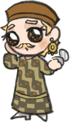


I have read Vermis and is inspired to make an artbook describing my worldbuilding. And linocut prints came to my mind when I try to imagine such a book. I like color and texture of ink when printed, as well as the rough quality of the lines. Printmaking is something entirely new to my, I have never try it before and only caught glimpses of it at college occasionaly when the graphic design students do their works.
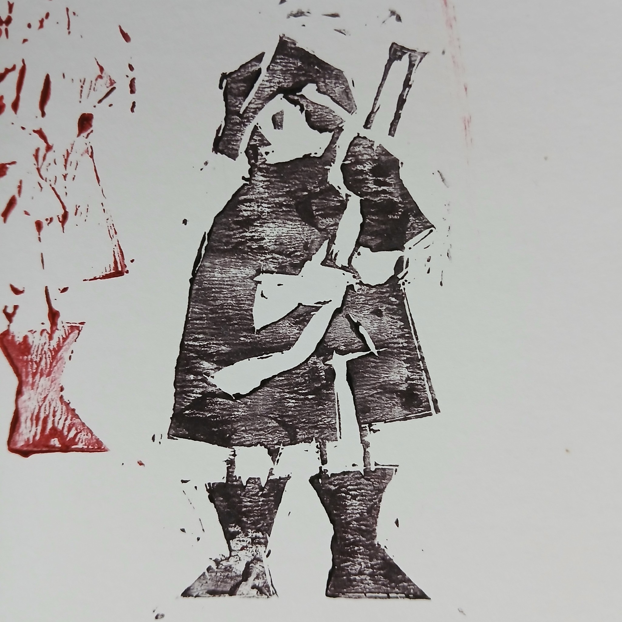
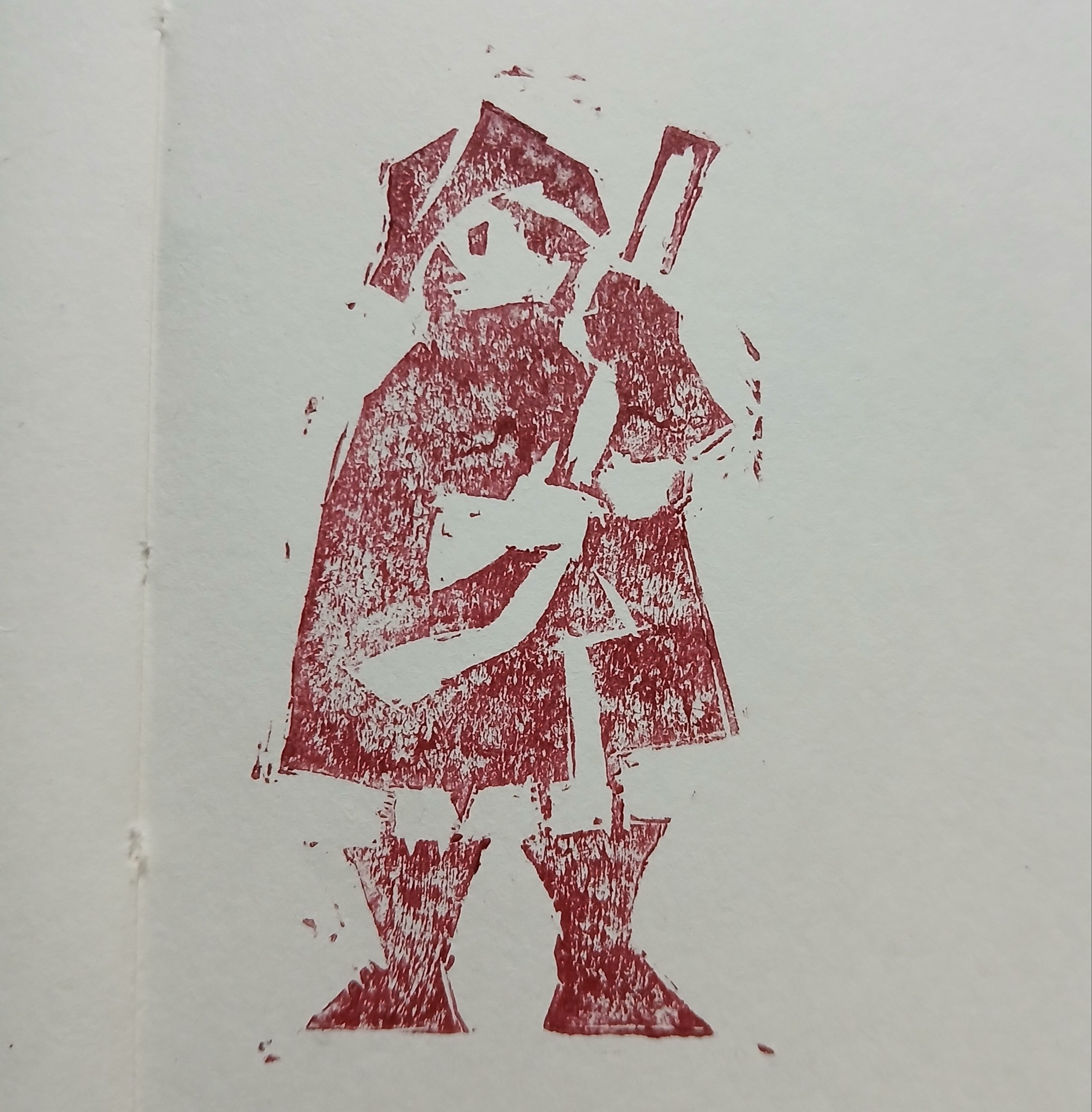
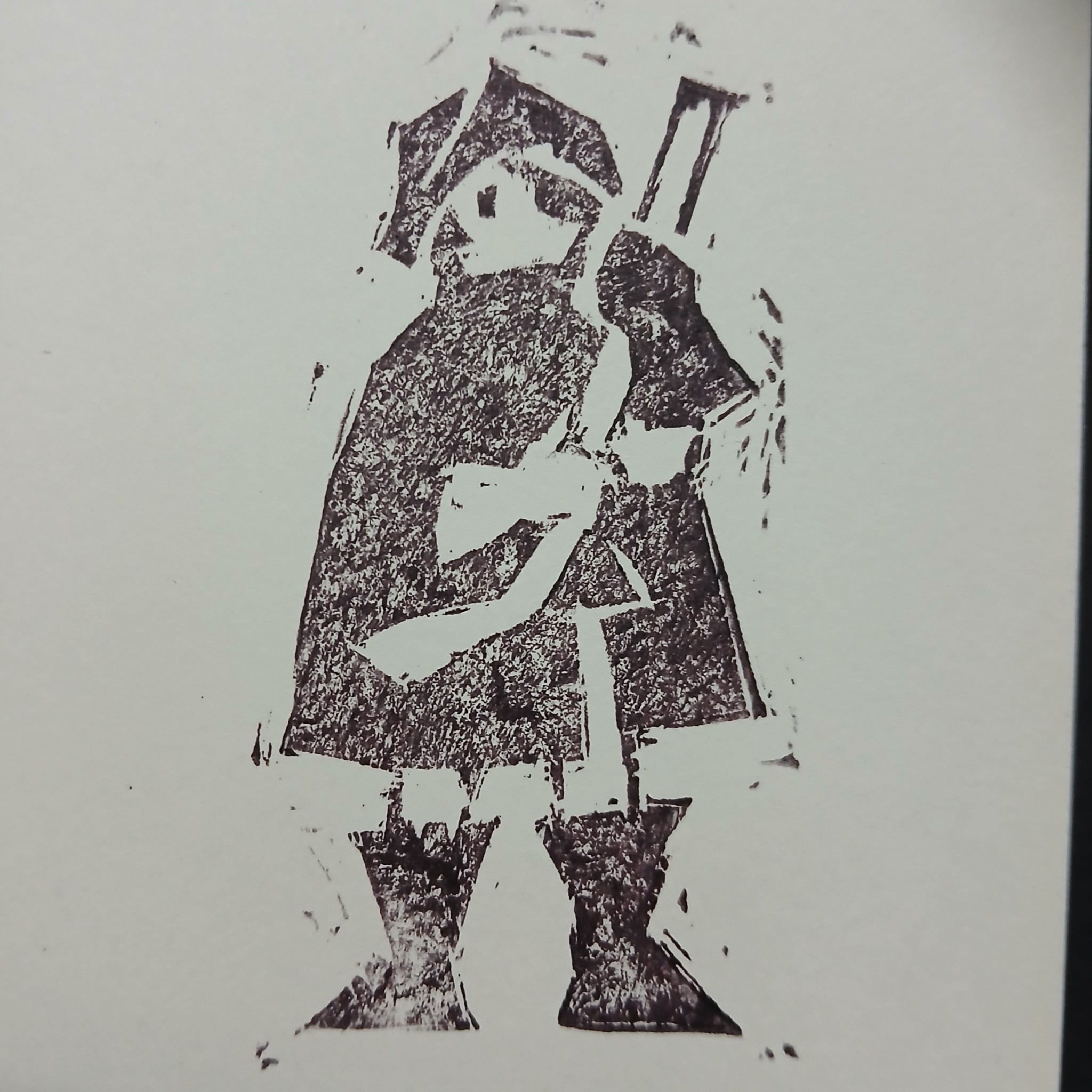
The supplies are bought. However, I bought a rubber block thinking it was linoleum, no problem though. The carving is quite tricky, since I only have a small v-shaped knife( the bigger ones are not shipped yet). The rubber is brittle and pulling out the excess often leaves its surface rough. On my first print, I realized that the carving was not deep enough so the image couldn't show properly. Carve deeper I did. Then I realize the ink I bought is a little strange, perhaps I bought the wrong type? It left a crumbly uneven texture in the print, making the image blurry. I mixed it with regular black imk and it seemed to look better. Here're the final results, take a look.
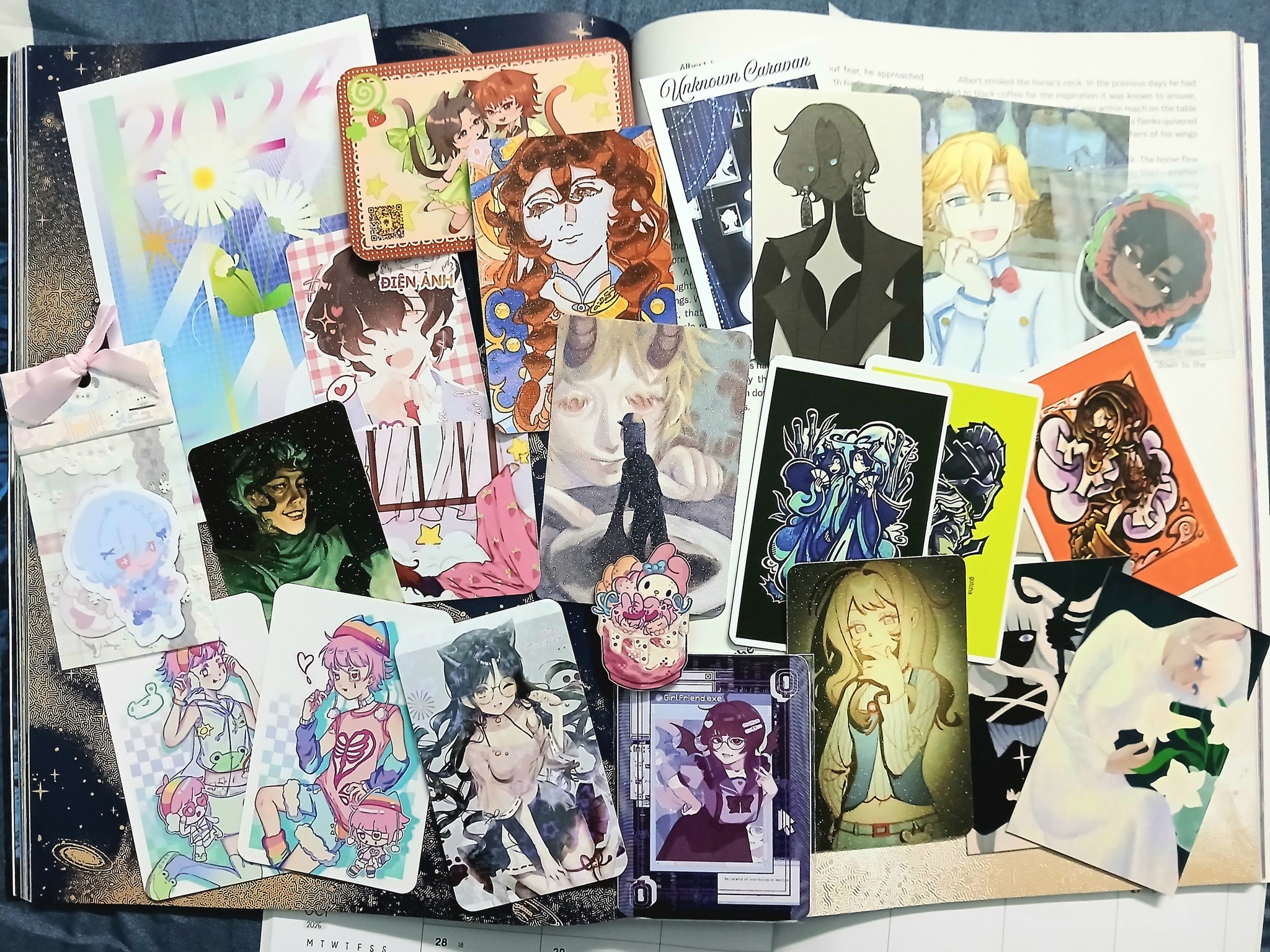
After a few months I got to go to a fes again. This time there was a lot of trouble with printing trading items(sticker sheets and toy money), but eventually we got through it. There was a specialized area for OC trading activities and most of my time was spent here. It was fun but I wasn't happy with how my stuffs looked, if only I had picked other artworks to trade. Anyway, at least I make new acquaintances. Hopefully it'll be way better next time.
I bought a Shrek badge. The look on his face never fail to make me laugh.

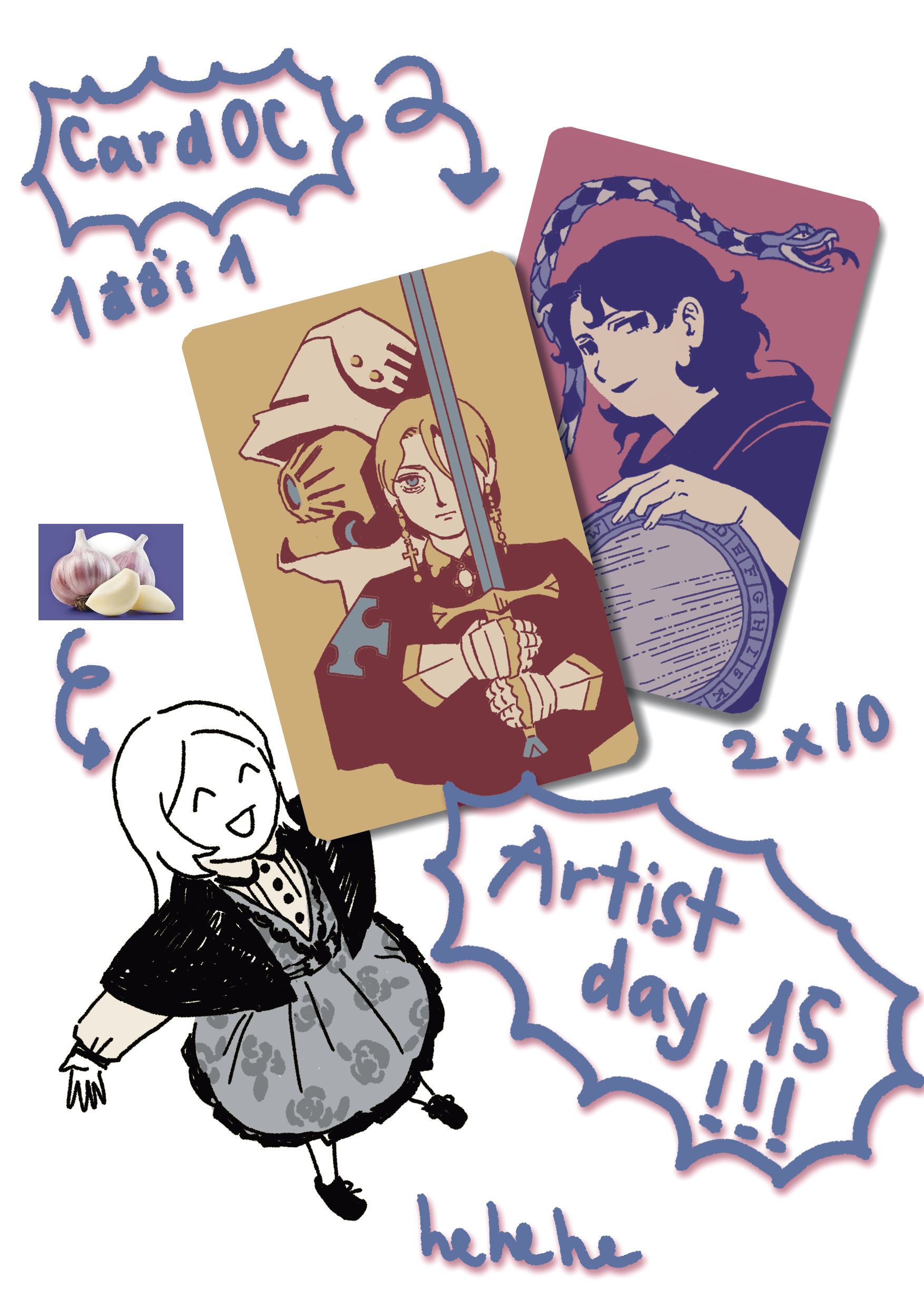
Finally I got to go to a fes, the last time was 3 years ago. This was actually my second times at one, despite me being a huge weeb. I was eager to participate in the exchange of OC cards, driven by my curiousity about other's characters and my hope for making new friends. It took a while to finish my own cards designs, actually I made two versions of them, the first didn't live up to my expectation so I scrapped them. There were no particular reason for my OCs of choice, these two has no connection to each others anyway.
Anyway here is how I looked on that day:
On that day, I went with my friend. It was a big shopping center with spacious yard andpicnics area, yet the booths were cramped. With so many people making their way through the booths, we had a hard time recognizing people. Afterward me and my friend went to eat dookki and had to wait for our number. The food was horrible and we both feel nauseous later on. Later, another friend of mine joined the party.
Here's what I got, both fandom and OC cards:
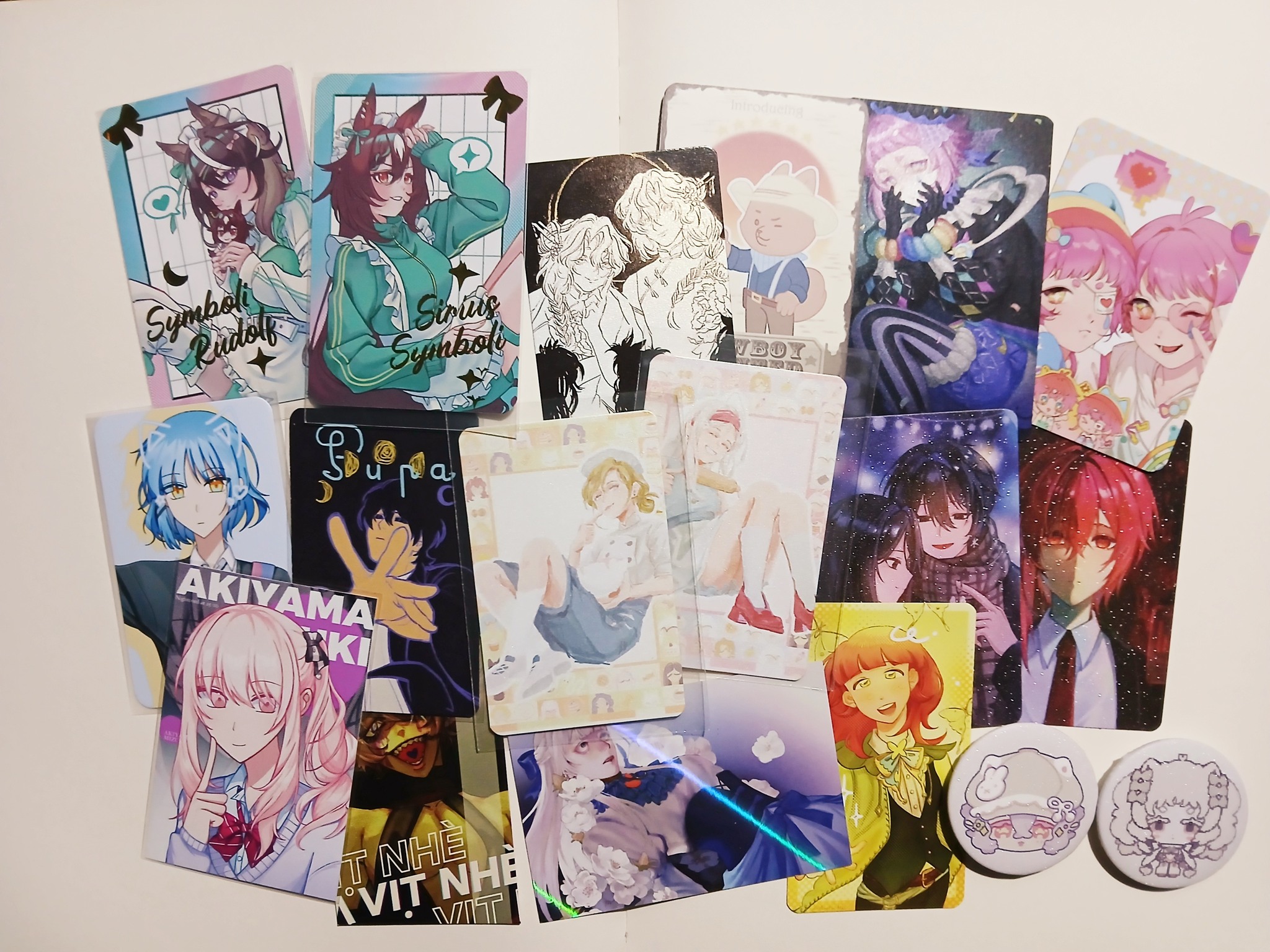
About the merchandises, my friend had bought lots of things. There were this pair of artprints she wanted but it was so hard to find the exact booth that sold them since there were so many booths bearing the same name arranged in a row. As for me, I only wanted to buy the man-cat badge yet when I arrived, it was sold out long ago.
Overall, it was a fun day. Though I didn't obtain the cards I wanted and didn't got to talk and make new friends, well I can try again. I would totally love to go to the next event!
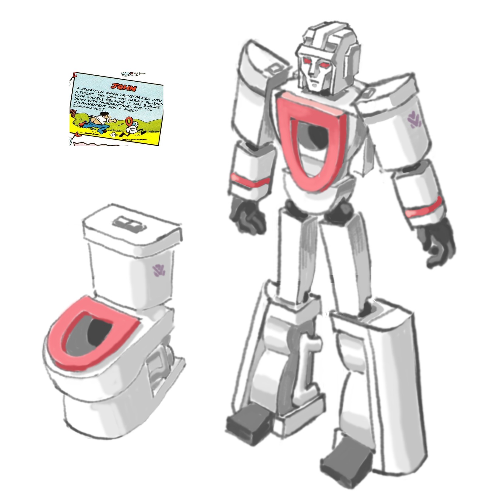
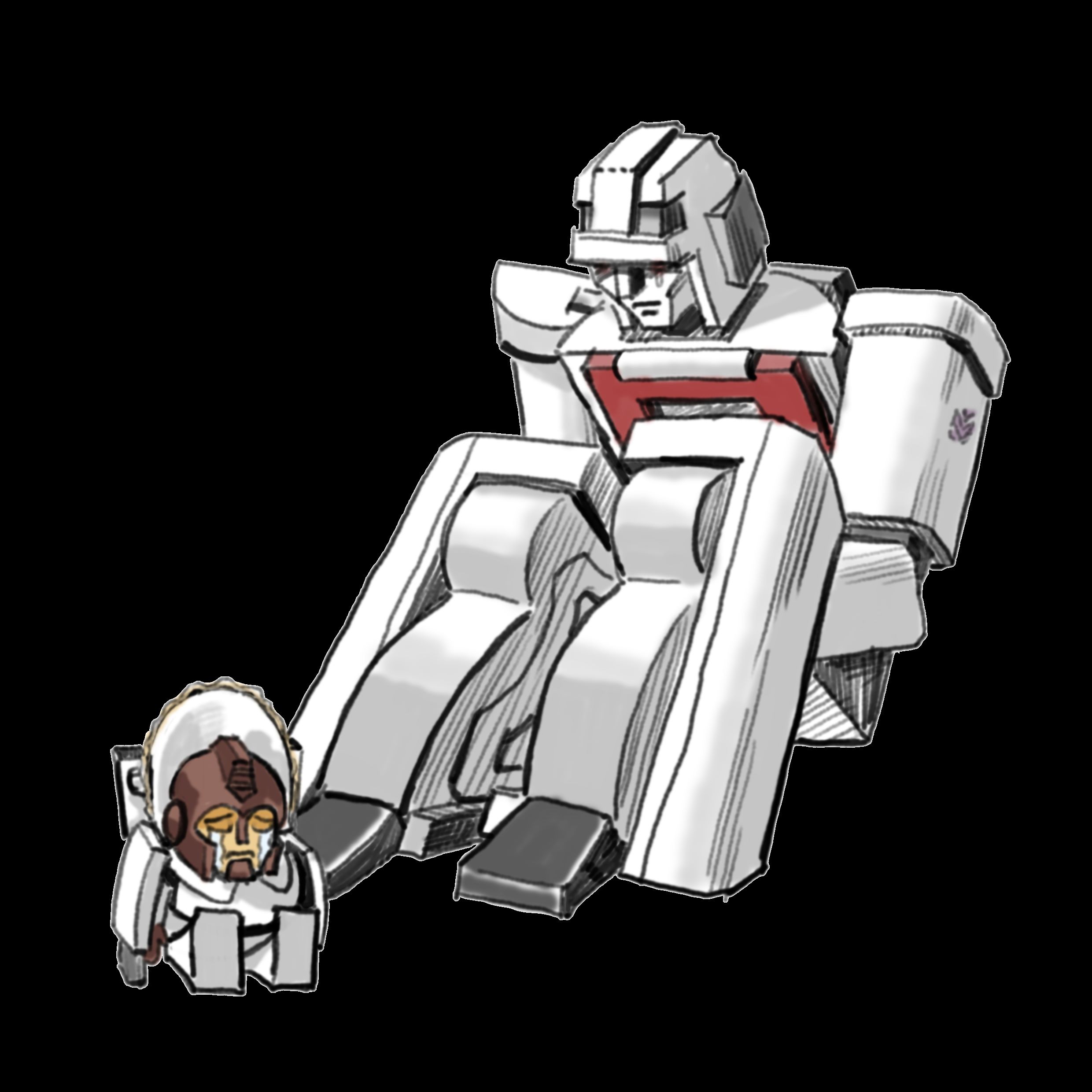
His name is Flushdown, a Decepticon who transforms into a toilet. Inspired by a Robo Caper design, his seat is colored red. This is his Marvel G1 appearance and he is also a headmaster with a Nebulan partner called Jon who is obsessed with cleanliness. He got into all kinds of predicaments but managed to survive to the end like a cockcroach. May get along with Needlenose and the like.
His lore is basically surviving the whole G1 Marvel timeline despite being pathetic. He even got to save Megatron from the junk on Cybertron and came out unscathed from Unicron's stomach from sheer luck.
Flushdown's relationship with his headmaster is abysmal and often a source of headache. He disliked the Nebulan's constant insult for being a toilet yet when the shit hit the fan they synchronised perfectly. Near the end of the timeline, he and his partner merged consciousness(which is kinda unusual) yet they were still too different and that gave Flushdown split personalities.
For a long time I have struggled with making Vietnamese characters display properly on my Commission info page. I tried to import fonts that support the language many times but it did not work and I could not find anything related to the issue on the Internet. A few days ago, I tried again and it occured to me that maybe it's because of my UniKey settings. Usually, I use Unicode as my character set and Telex as my typing style. So I changed these two settings manually to see which combination work. Turned out that NCR decimal works with both Telex and VNI, the text finally displayed properly on the site and no longer looks like moon rune(well, it still looks like moon rune, but only in the code). However, it only worked for Time New Roman, as when I import the VnSouthern font, it became moon rune again and altering the setting seemingly had no effect.
In the end i just use TNR and leave it like that. At this point I'm not particularly interested in learning more about coding even though I know that my knowledge is barely suffiecient. It's overwhelming and my energy is running out, but maybe I'll try to study it again in the future.
I got to watch Transformers One with my friend last Friday night. We went to the wrong building and was late to the screening, but we still managed to buy tickets for later time slot which turned out to be a dub. We were the last people who stayed after the credit ended even though we ended up standing outside of the room peeking in when the after credit is shown.
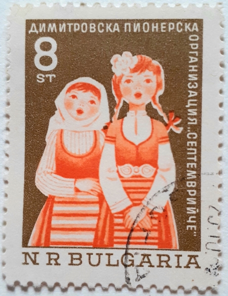
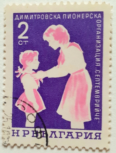
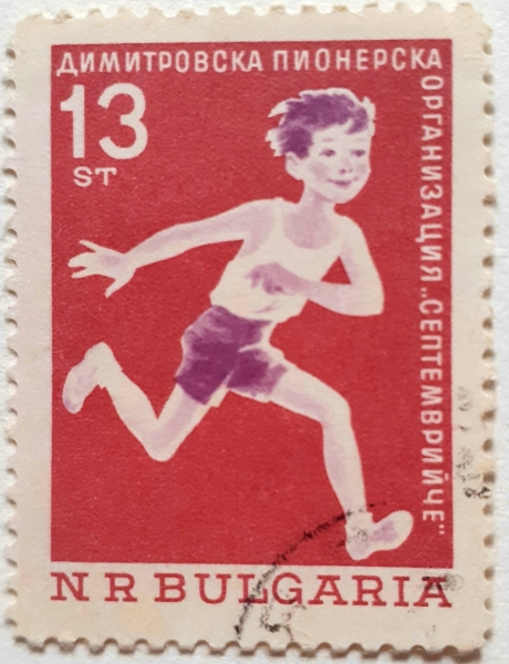
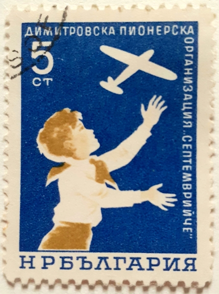
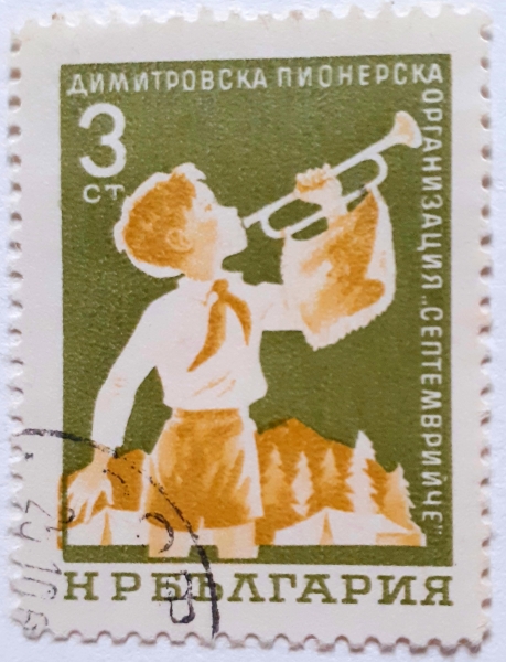
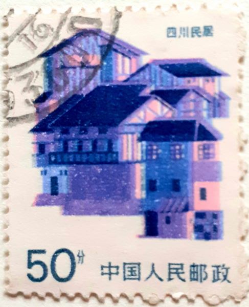
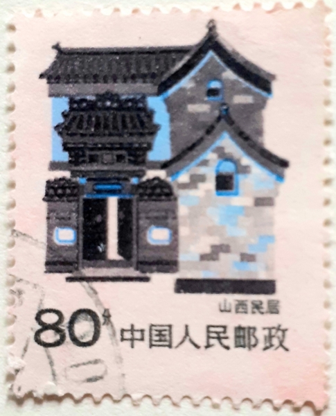
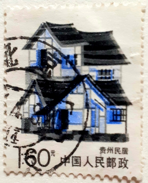
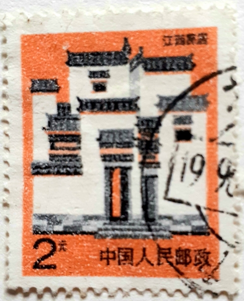
These stamps are part of a stamp collection my relative gave me. They look really cute, I wish I knew who drew the Bulgarian stamps.
|
|
|
|

|
|
Bulgarian stamps For our children foundation series(1965).
Stamps from PRC's 1991 Folk house series.
|
|

|
|
|
From left to right: Sichuan folk house, Shanxi folk house, Shanghai folk house, Guizhou folk house, Jiangxi folk house.
Blog created. Actually Idk what to do with it.
Page:[1]